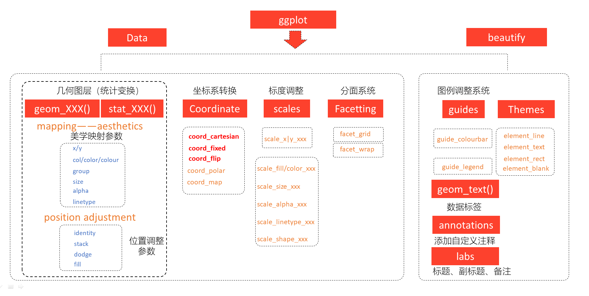
4 使用 ggplot2 包绘图
4.1 简介
ggplot2 包是 Harley Wickham 在 2005 年创建的,是包含了一套全面而连贯的语法的绘图系统。

Harley Wickham
弥补了R中创建图形缺乏一致性的缺点,且不会局限于一些已经定义好的统计图形,可以根据需要创造出任何有助于解决所遇到问题的图形。
核心理念:将绘图与数据分离,数据相关的绘图与数据无关的绘图分离,按图层作图。
4.2 qplot
ggplot2包的绘图语言与常用的绘图函数的使用方法不同,为了让读者快速使用ggplot2包,包的作者Harley
Wickham提供了qplot函数(quick
plot),让人在了解ggplot2的语言逻辑之前,就能迅速实现数据的可视化。
鸢尾花数据集iris
head(iris,10)## Sepal.Length Sepal.Width Petal.Length Petal.Width Species
## 1 5.1 3.5 1.4 0.2 setosa
## 2 4.9 3.0 1.4 0.2 setosa
## 3 4.7 3.2 1.3 0.2 setosa
## 4 4.6 3.1 1.5 0.2 setosa
## 5 5.0 3.6 1.4 0.2 setosa
## 6 5.4 3.9 1.7 0.4 setosa
## 7 4.6 3.4 1.4 0.3 setosa
## 8 5.0 3.4 1.5 0.2 setosa
## 9 4.4 2.9 1.4 0.2 setosa
## 10 4.9 3.1 1.5 0.1 setosastr(iris)## 'data.frame': 150 obs. of 5 variables:
## $ Sepal.Length: num 5.1 4.9 4.7 4.6 5 5.4 4.6 5 4.4 4.9 ...
## $ Sepal.Width : num 3.5 3 3.2 3.1 3.6 3.9 3.4 3.4 2.9 3.1 ...
## $ Petal.Length: num 1.4 1.4 1.3 1.5 1.4 1.7 1.4 1.5 1.4 1.5 ...
## $ Petal.Width : num 0.2 0.2 0.2 0.2 0.2 0.4 0.3 0.2 0.2 0.1 ...
## $ Species : Factor w/ 3 levels "setosa","versicolor",..: 1 1 1 1 1 1 1 1 1 1 ...- 例子一:
创建一个以物种种类为分组的花萼长度的箱线图,箱线图的颜色依据不同的物种种类而变化。
library(ggplot2)
qplot(Species, Sepal.Length, data = iris, geom = "boxplot",
      fill = Species,main = "依据种类分组的花萼长度箱线图")
boxplot(Sepal.Length~Species,data =iris,main = "依据种类分组的花萼长度箱线图")
- 例子二:
利用qplot函数画出小提琴图,只需要将geom设置为“violon”即可,并添加扰动以减少数据重叠。
qplot(Species, Sepal.Length, data = iris, geom = c("violin", "jitter"),
      fill = Species,main = "依据种类分组的花萼长度小提琴图")
- 例子三:
建一个以花萼长度和花萼宽度的散点图,并利用颜色和符号形状区分物种种类。
qplot(Sepal.Length, Sepal.Width, geom = "point",data = iris, colour = Species,
      shape = Species,main = "绘制花萼长度和花萼宽度的散点图")
- 例子四:
利用facets参数绘制分面板散点图,并增加光滑曲线。
qplot(Sepal.Length, Sepal.Width, data = iris, geom = c("point", "smooth"),
      facets = ~Species,main = "绘制分面板的散点图")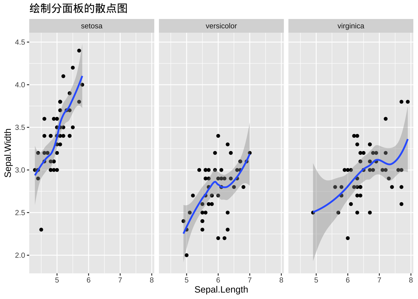
4.3 ggplot2包图形语法
推荐书籍:
ggplot2: Elegant Graphics for Data Analysis https://ggplot2-book.org/
Fundamentals of Data Visualization https://clauswilke.com/dataviz/
4.3.1 对比不同画图语法
以绘制iris数据集中Sepal.Length与Sepal.Width的散点图为例,分别采用内置的plot函数与ggplot2包的ggplot函数绘制散点图,对比理解ggplot2包的语言逻辑。
代码(三种类型):
# 基础包
plot(iris$Sepal.Length, iris$Sepal.Width)
# qplot()
qplot(x = Sepal.Length, y = Sepal.Width,data = iris,geom = "point")
# ggplot()
ggplot(data= iris, aes(x = Sepal.Length, y = Sepal.Width)) +  #绘制底层画布
geom_point()  #在画布上添加点
4.3.2 思想介绍
注:该部分主要参考数据科学中的R语言——王敏杰。
ggplot的绘图有以下几个特点。
有明确的起始(以ggplot函数开始)与终止(一句语句一幅图)。
ggplot2语句可以理解为一句语句绘制一幅图,然后进行图层叠加,而叠加是通过”+“号把绘图语句拼接实现的。
ggplot函数包括9个部件:
- 数据 (data) ( 数据框)
- 映射 (mapping)
- 几何对象 (geom_point() , geom_boxplot())
- 统计变换 (stats)
- 标度 (scale)
- 坐标系 (coord)
- 分面 (facet)
- 主题 (theme)
- 存储和输出 (output)
其中前三个是必需的。
Hadley Wickham将这套可视化语法诠释为:一张统计图形就是从数据到几何对象(geometric object,缩写geom)的图形属性(aesthetic attribute,缩写aes)的一个映射。
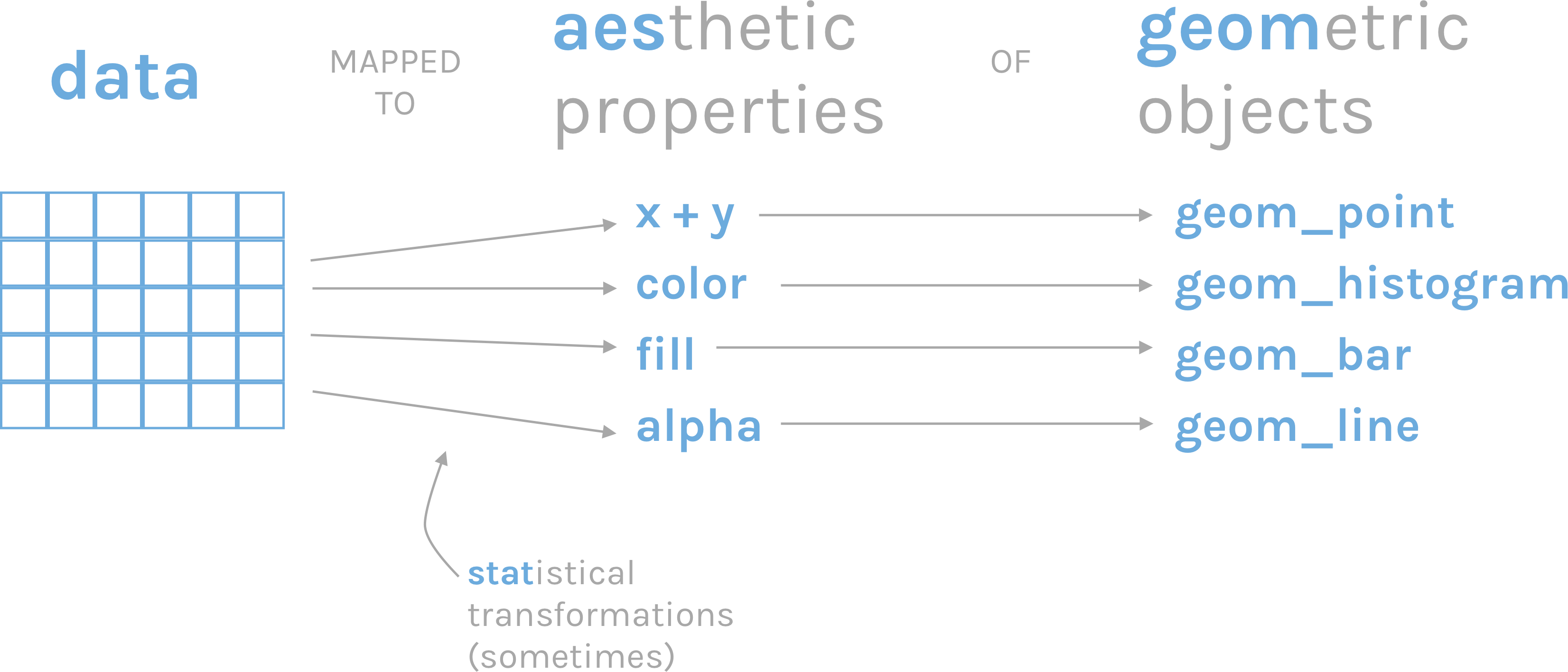
此外,图形中还可能包含数据的统计变换(statistical transformation,缩写stats),最后绘制在某个特定的坐标系(coordinate system,缩写coord)中,而分面(facet)则可以用来生成数据不同子集的图形。
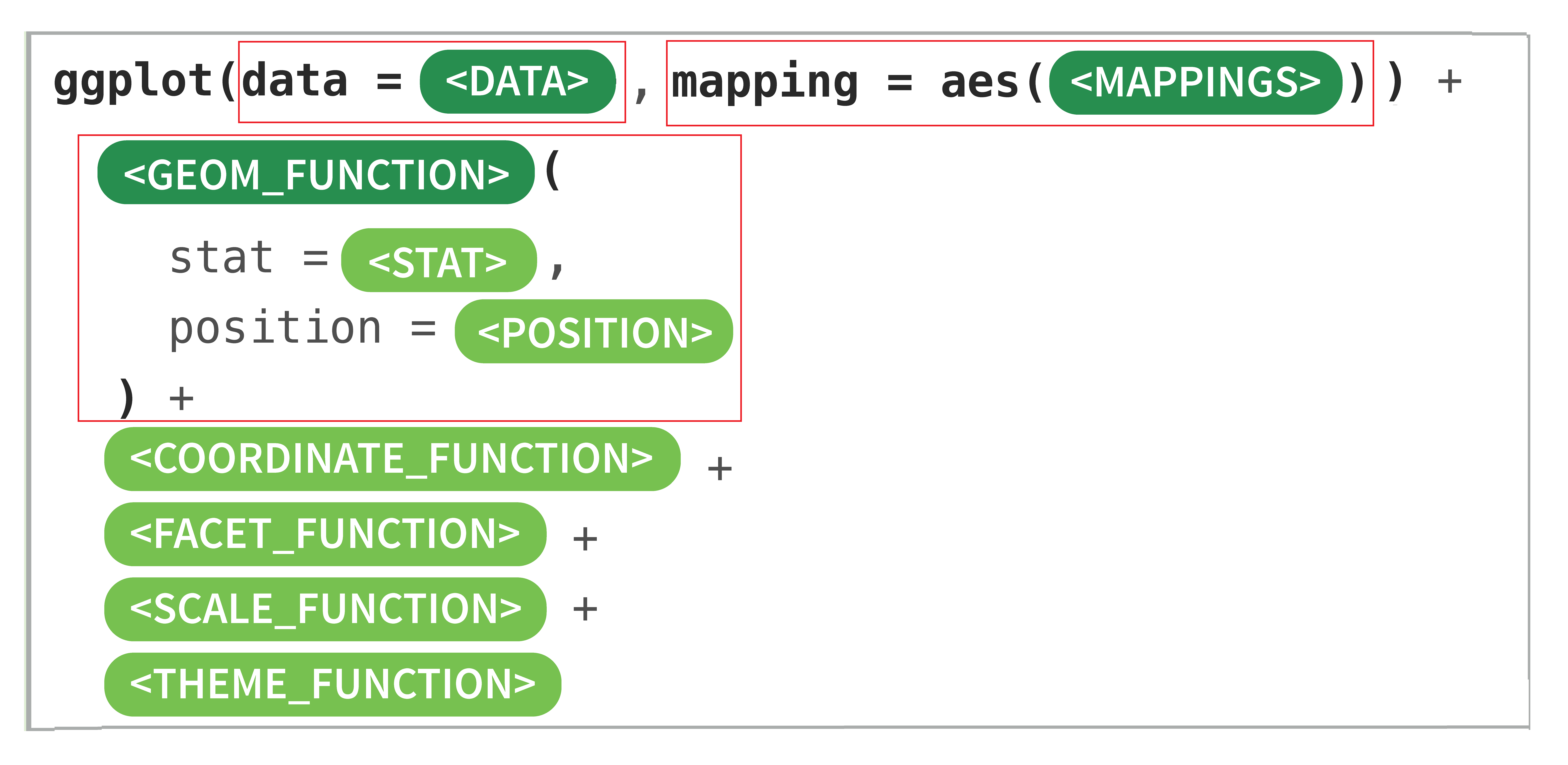
语法模板
把这看懂其实差不多了
例子(带你入门)
ggplot(data = iris, mapping = aes(Petal.Length,Petal.Width)) +
  geom_point(size = 2,alpha = 0.5,col ="red") +
  geom_smooth(method = "lm",se = F)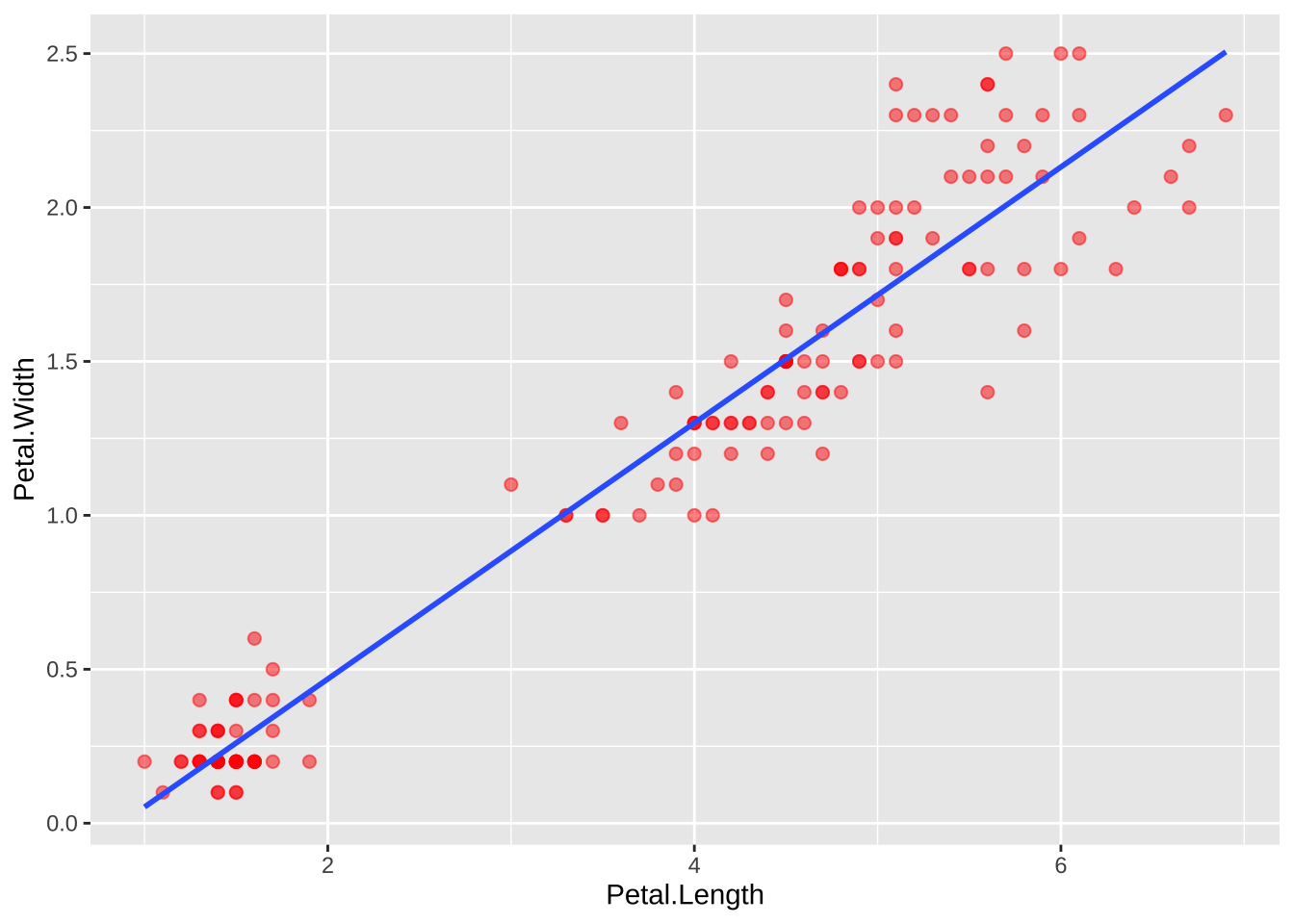
4.3.3 全局变量 vs. 局部变量
ggplot(data = iris, mapping = aes(x = Petal.Length,y = Petal.Width, col = Species)) +
geom_point() 
ggplot(data = iris) +
  geom_point(mapping = aes(x = Petal.Length,y = Petal.Width, col = Species))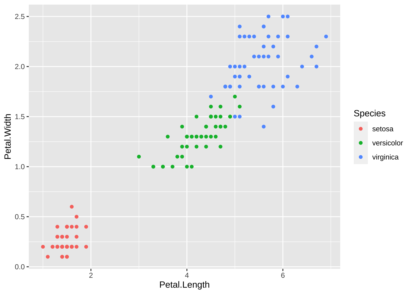
大家可以看到,以上两段代码出来的图是一样。但背后的含义却不同。
例子(观察两者之间的区别)
#版本一
ggplot(data = iris, mapping = aes(x = Petal.Length,y = Petal.Width, col = Species)) +
  geom_point() +
geom_smooth() 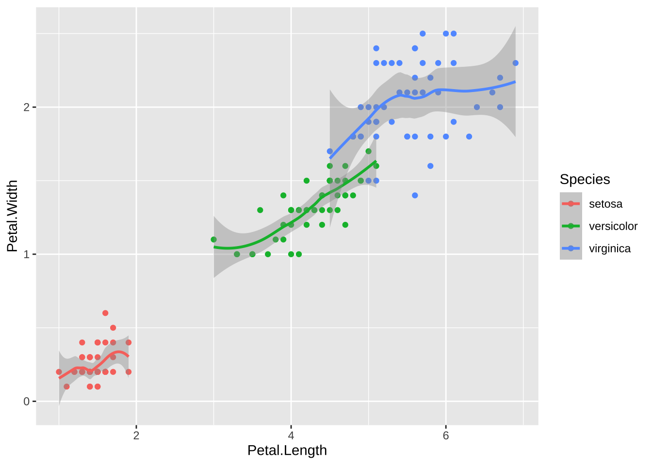
# 版本二
ggplot(data = iris, mapping = aes(x = Petal.Length,y = Petal.Width)) +
  geom_point(mapping = aes(col = Species)) +
  geom_smooth()
4.4 几何对象
geom_xxx()提供了各种基本图形。 列表如下:
基础图形:
geom_blank()不画图,可以按映射的变量设定坐标范围;geom_point()每个观测为一个散点;geom_hline(),geom_vline(),geom_abline()画线;geom_path()每个观测提供坐标,在相邻观测之间连线;geom_ribbon()需要x和ymin, ymax维,在从小到大排序后的相邻观测之间连接阴影区域;geom_segment()需要x, y和xend, yend,为每个观测画一条线段;geom_rect()需要xmin, xmax, ymin, ymax,为每个观测画一个长方形,可有填充色;geom_polygon()需要x, y,将相邻观测连续并连接成一个闭合的多边形,中间填充颜色;geom_text()需要x, y和lable,每个观测画一条文字标签。
单变量图层:
geom_bar(),geom_col()作条形图;geom_histogram()对连续变量x作直方图;geom_density()对连续变量x作一元密度估计曲线;geom_dotplot()用原点作直方图;geom_freqpoly()用折线作直方图。
两变量图形:
两个连续变量x, y:
geom_point()散点图;geom_quantile()拟合分位数回归曲线;geom_rug()在坐标轴处画数值对应的短须线;geom_smooth()画各种拟合曲线;geom_text()在指定的x, y位置画label给出的文字标签;
显示二元分布:
geom_bin2d()作长方形分块的二维直方图;geom_density2d()作二元密度估计等值线图;geom_hex()作正六边形分块的二维直方图。
两个变量中有分类变量时:
geom_count():重叠点越多画点越大;geom_jitter(): 随机扰动散点位置避免重叠,数值变量有重叠时也可以用;
一个连续变量和一个分类变量:
geom_col()作条形图,对分类变量的每个值画一个条形,长度与连续变量值成比例;geom_boxplot()对每个类做一个盒形图;geom_violin()对每个类做一个小提琴图。
一个时间变量和一个连续变量:
geom_area()作阴影曲线图,曲线下方填充阴影色;geom_line()作折线图,在相邻两个时间之间连接线段;geom_step()作阶梯函数图,在相邻两个时间之间连接阶梯函数线。
不确定性:
geom_crossbar()对每个观测输入的x, y, ymin, ymax画中间有线的纵向条形;geom_errbar()对每个观测输入的x, ymin, ymax画纵向误差条;geom_linerange()对每个观测输入的x, ymin, ymax画一条竖线;geom_pointrnage()对每个观测输入的x, y, ymin, ymax画一条中间有点的竖线。
地图:
geom_map(): 用区域边界坐标数据画边界线地图。
三个变量:
geom_contour(): 用输入的x, y, z数据画等值线图。geom_tile()用输入的x, y位置, width, height大小和指定的fill维画长方形色块填充图。geom_raster()是geom_tile()的长方形大小相同时的快速版本。
4.4.1 参考书籍
由于这部分内容非常的多,短短两小时不可能讲完,这里给了一些参考资料,各个都是满满的干货。
Chapter 3: Data Visualisation of R for Data Science
Chapter 28: Graphics for communication of R for Data Science
Graphs in R Graphics Cookbook
4.5 统计变换
概念:对数据所应用的统计类型/方法。
ggplot2为每一种几何类型指定了一种默认的统计类型,如果仅指定geom或stat中的一个,另外一个会自动获取。其中,stat_identity则表示不做任何的统计变换。
示例:只需指定geom或stat中的一个,具体细小细节可以参考这 https://bookdown.org/wangminjie/R4DS/ggplot2-stat-layer.html
ggplot(iris) +
  geom_bar(aes(x=Sepal.Length), stat="bin", binwidth = 0.5)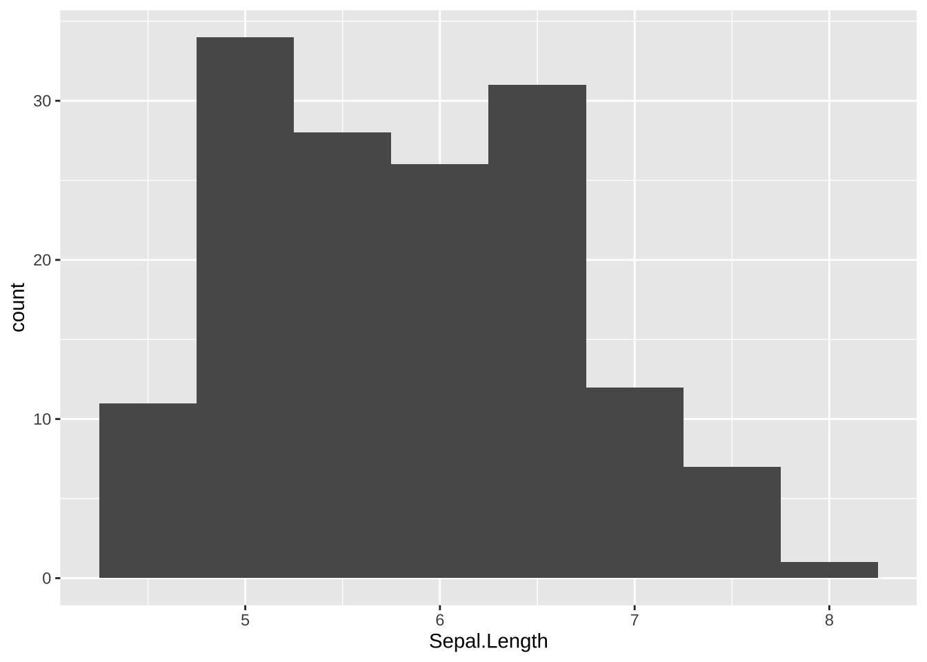
ggplot(iris) +
  stat_bin(aes(x=Sepal.Length), geom="bar", binwidth = 0.5)
4.6 刻度scale
这一节我们一起学习ggplot2中的scales语法,推荐大家阅读Hadley Wickham最新版的《ggplot2: Elegant Graphics for Data Analysis》,但如果需要详细了解标度参数体系,还是要看ggplot2官方文档
在ggplot()的mapping参数中指定x维、y维、color维等,实际上每一维度都有一个对应的默认刻度(scale),即,将数据值映射到图形中的映射方法。
如果需要修改刻度对应的变换或者标度方法,可以调用相应的scale_xxx()函数。
画图都没用到scale啊!
能画个很漂亮的图,那是因为ggplot2默认缺省条件下,已经很美观了。(据说Hadley Wickham很后悔使用了这么漂亮的缺省值,因为很漂亮了大家都不认真学画图了。马云好像也说后悔创立了阿里巴巴?)
#解释
ggplot(data = iris, mapping = aes(x = Petal.Length,y = Petal.Width, col = Species)) +
  geom_point() +
geom_smooth() 
4.6.1 丰富的刻度体系
注意:标度函数是由”_“分割的三个部分构成的 - scale - 视觉属性名 (e.g., colour, shape or x) - 标度名 (e.g., continuous, discrete, brewer).
- 将数据变量映射到具体的位置、颜色、填充色、大小、符号等。
每个标度函数内部都有丰富的参数系统
scale_colour_manual(
  palette = function(),
  limits = NULL,
  name = waiver(),
  labels = waiver(),
  breaks = waiver(),
  minor_breaks = waiver(),
  values = waiver(),
  ...
)
参数
name,坐标和图例的名字,如果不想要图例的名字,就可以name = NULL参数
limits, 坐标或图例的范围区间。连续性c(n, m),离散型c("a", "b", "c")参数
breaks, 控制显示在坐标轴或者图例上的值(元素)参数
labels, 坐标和图例的间隔标签- 一般情况下,内置函数会自动完成
- 也可人工指定一个字符型向量,与
breaks提供的字符型向量一一对应 - 也可以是函数,把
breaks提供的字符型向量当做函数的输入 NULL,就是去掉标签
参数
values指的是(颜色、形状等)视觉属性值,- 要么,与数值的顺序一致;
- 要么,与
breaks提供的字符型向量长度一致 - 要么,用命名向量
c("数据标签" = "视觉属性")提供
参数
expand, 控制参数溢出量参数
range, 设置尺寸大小范围,比如针对点的相对大小
下面,我们通过具体的案例讲解如何使用参数,把图形变成我们想要的模样。
例子:随机从iris数据集的150个样本中抽取100个样本,并绘制条形图反映100个样本中各个鸢尾花种类的数量情况。然后通过修改标尺参数做前后对比图,进而理解标尺在ggplot2包中的作用。
set.seed(1)  # 设置随机种子
my_iris <- iris[sample(1:150, 100, replace = FALSE),]  # 随机抽样

p <- ggplot(my_iris) +
  geom_bar(aes(x = Species, fill = Species))
p
p + scale_fill_manual(
    values = c("orange", "red", "lightyellow3"),  # 颜色设置
    name = NULL,  # 图例和轴使用的名称
    labels = c("set", "ver", "vir")  # 图例使用的标签
)  +
  scale_x_discrete(labels = c("set", "ver", "vir"),name = "A") +
  scale_y_continuous(name = "B",breaks = c(20,40)) +
  theme_bw()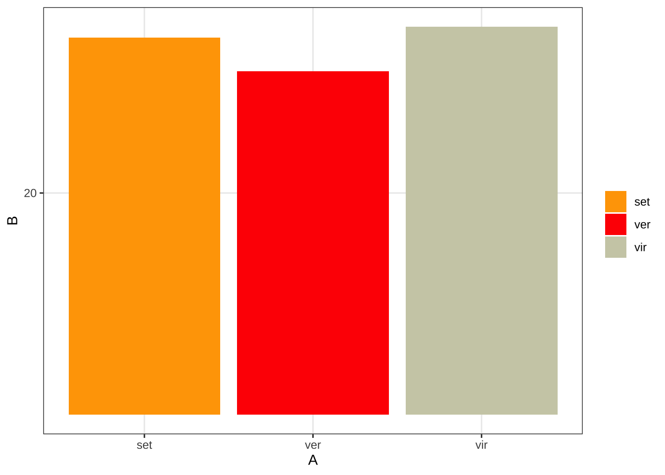
使用scale_color_manual或scale_color_brewer函数修改图形的颜色。在对iris数据集中的Sepal.Length与Sepal.Width的散点图分别使用以上两种方法修改散点颜色
#图一:使用scale_color_manual函数
ggplot(iris, aes(x = Sepal.Length, y = Sepal.Width, colour = Species))+
  geom_point(size = 2) +
  scale_color_manual(values = c("orange", "olivedrab", "navy"),
name = NULL) 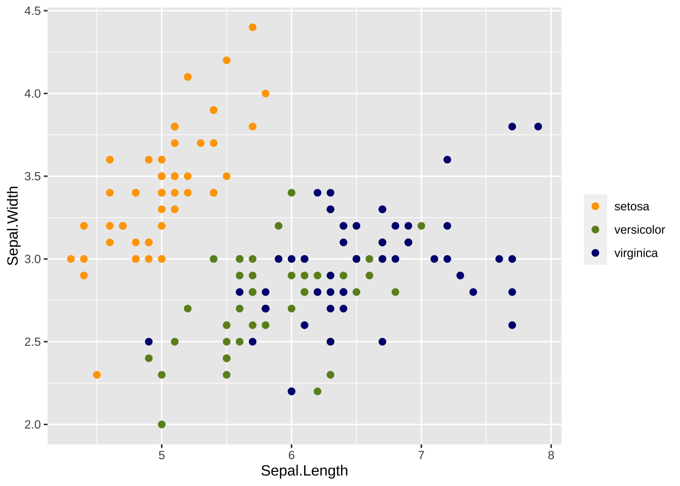
#图二:使用scale_color_brewer函数
ggplot(iris,aes(x = Sepal.Length, y = Sepal.Width, colour = Species))+
  scale_color_grey()+
geom_point(size=2) 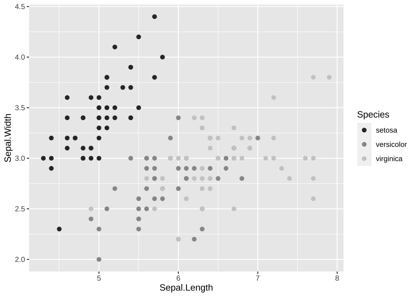
# library(RColorBrewer)
# brewer.pal(3, "Set1")
# display.brewer.all()
4.7 坐标系
ggplot2默认的坐标系是笛卡尔坐标系,可以用如下方法指定取值范围:coord_cartesian(xlim = c(0,5), ylim = c(0, 3))。
coord_flip:x轴和y轴换位置。
coord_polar(theta = "x",direction=1)是角度坐标系,theta指定角度对应的变量,start指定起点离12点钟方向的偏离值,direction若为1表示顺时针方向,若为-1表示逆时针方向。
# 饼图 = 堆叠长条图 + polar_coordinates
pie <- ggplot(my_iris, aes(x = factor(1), fill = Species)) +
  geom_bar(width = 1)
pie + coord_polar(theta = "y",direction = -1,start = 30)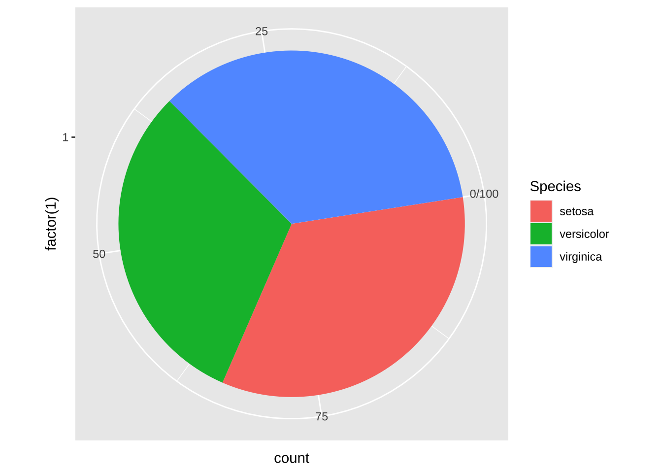
# 靶心图 = 饼图 + polar_coordinates
pie + coord_polar()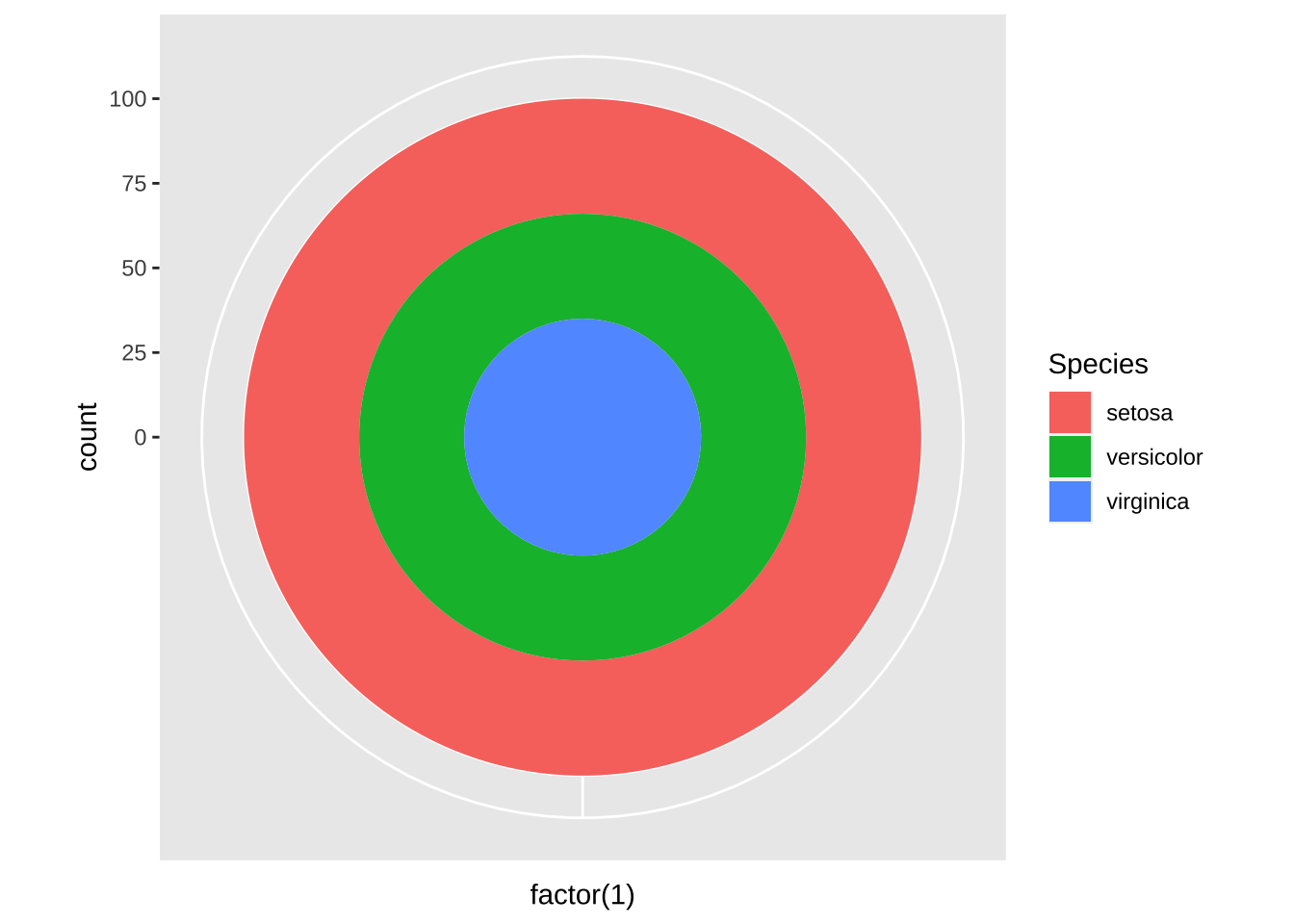
#锯齿图 = 柱状图 + polar_coordinates
cxc <- ggplot(my_iris, aes(x = Species)) +
  geom_bar(width = 1, colour = "black")
cxc + coord_polar()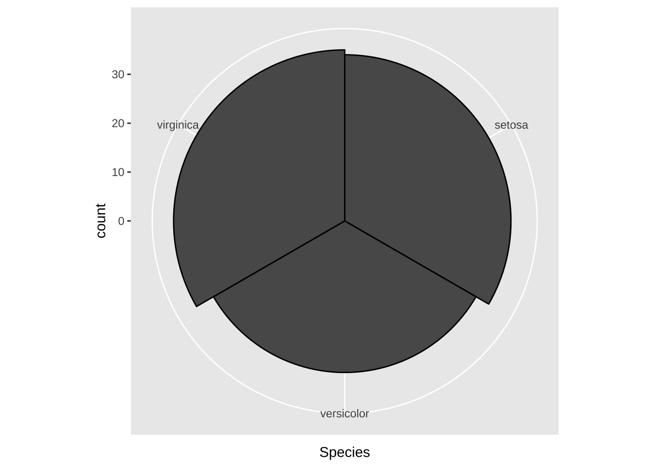
4.8 分面
分面,就是分组绘图,根据定义的规则,将数据分为多个子集,每个子集按照统一的规则单独制图,排布在一个页面上。
ggplot2提供两种分面方法:facet_grid函数和facet_wrap函数。
1. facet_grid函数
注意facet_grid函数是一个二维的矩形布局,每个子集的位置由行位置变量~列位置变量的决定
library(ggplot2)
library(tidyr)
library(dplyr)
my_iris1 <- iris %>% gather(feature_name, feature_value, one_of(c("Sepal.Length", "Sepal.Width", "Petal.Length", "Petal.Width")))  # 数据变换
ggplot(my_iris1) +
  geom_violin(aes(x = Species, y = feature_value)) +  # 绘制小提琴图
  facet_grid(feature_name ~ Species, scales = "free")  # 分面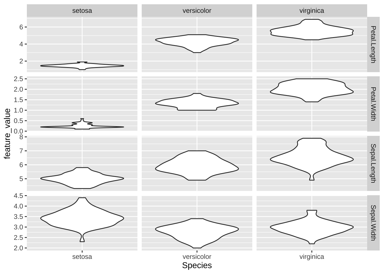
# iris例子
ggplot(data = iris, mapping = aes(x = Sepal.Length, y = Sepal.Width)) +  # 底层画布
  geom_point() +
  geom_smooth() +
  facet_grid(~Species)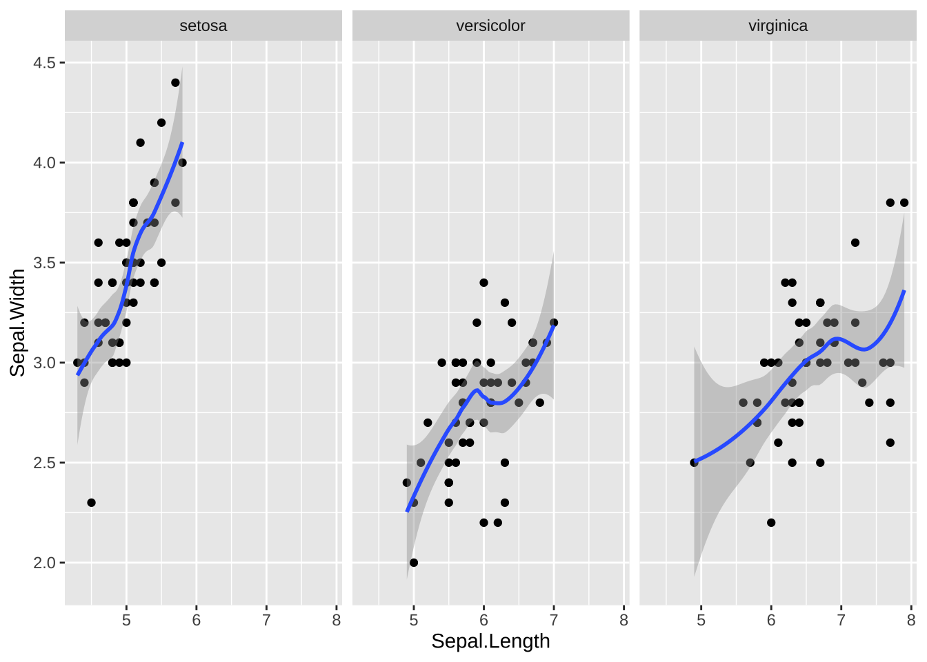
2. facet_wrap函数
facet_wrap函数生成一个动态调整的一维布局,根据”~位置变量1+位置变量2+…“来确定每个子集的位置,先逐行排列,放不下了移动到下一行。
ggplot(my_iris1) +
  geom_violin(aes(x = Species, y = feature_value)) +
  facet_wrap(~ feature_name + Species, scales = "free_y",nrow = 3,
             strip.position = "bottom")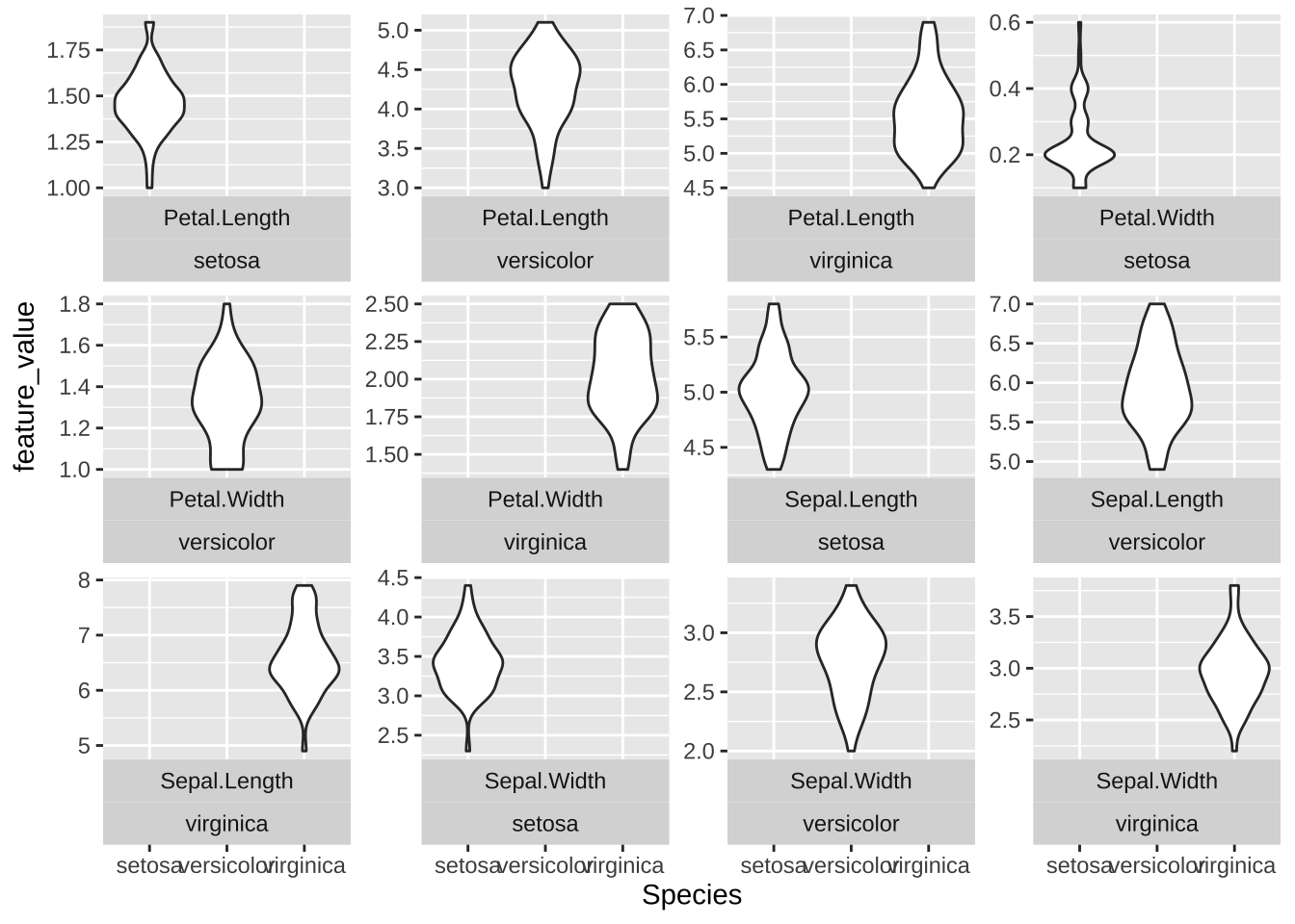
# iris例子
ggplot(data = iris, mapping = aes(x = Sepal.Length, y = Sepal.Width)) +  # 底层画布
  geom_point() +
  geom_smooth()+
  facet_wrap(~Species)
4.9 标题、标注、指南、拼接
除了ggplot()指定数据与映射,geom_xxx()作图,还可以用许多辅助函数增强图形。
labs()可以设置适当的标题和标签。annotate()函数可以直接在坐标系内进行文字、符号、线段、箭头、长方形的绘制。guides()函数可以控制图例的取舍以及做法。theme()函数可以控制一些整体的选项如背景色、字体类型、图例的摆放位置等。
4.9.1 标题
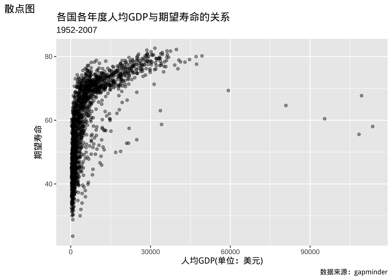
函数labs()可以用来指定图形上方的标题(title)、副标题(subtitle)、右下方的标注(caption)、左上方的标签以及坐标轴标题和其它维的名称。
例如:
library(gapminder)
p <- ggplot(data = gapminder,
  mapping = aes(
    x = gdpPercap,
    y = lifeExp))
p + geom_point(alpha = 0.4) +
  labs(
    title = "各国各年度人均GDP与期望寿命的关系",
    subtitle = "1952-2007",
    tag = "散点图",
    caption = "数据来源:gapminder",
    x = "人均GDP(单位:美元)",
    y = "期望寿命"
  )
#iris案例
ggplot(data = iris, mapping = aes(x = Sepal.Length, y = Sepal.Width)) +  # 底层画布
  geom_point() +
  geom_smooth() +
  labs(
    title = "22",
    subtitle = "22",
    caption = "22"
  )
labs()只是提供了这些标题功能,一般并不会同时使用这些功能。
在出版图书内,图形下方一般伴随有图形说明,这时一般就不再使用标题、副标题、标签、标注,而只需写在图的伴随说明文字中,当然,坐标轴标签一般还是需要的。
4.9.2 标注功能
通过annotate(geom = "text")调用geom_text()的功能,
可以在一个散点图中标注多行文字,多行之间用"\n"分开:
在annotate()中选geom="rect",给出长方形的左右和上限界限,
可以将上面图形中最右侧偏低的点用长方形填充标出。
可以在annotate()中选geom="line"画线,需要给出线的起点和终点坐标,可以arrow选项要求画箭头,用arrow()函数给出箭头的大小、角度等设置,
如:
p + geom_point() +
  geom_smooth(method="gam") +
  scale_x_log10() +
  annotate(geom = "rect",
           xmin = 5.5E4, xmax = 1.2E5,
           ymin = 54, ymax = 71,col = 'red',fill = 'red',alpha = 0.5) +
  annotate(geom = "line",
           x = c(5.9E4, 3.16E4),
           y = c(53,  40),
           arrow = arrow(angle = 20, length = unit(4, "mm"))) +
  annotate(geom = "text",
           x = 3.16E4, y = 38,
           label = "这些国家的期望寿命低于预期")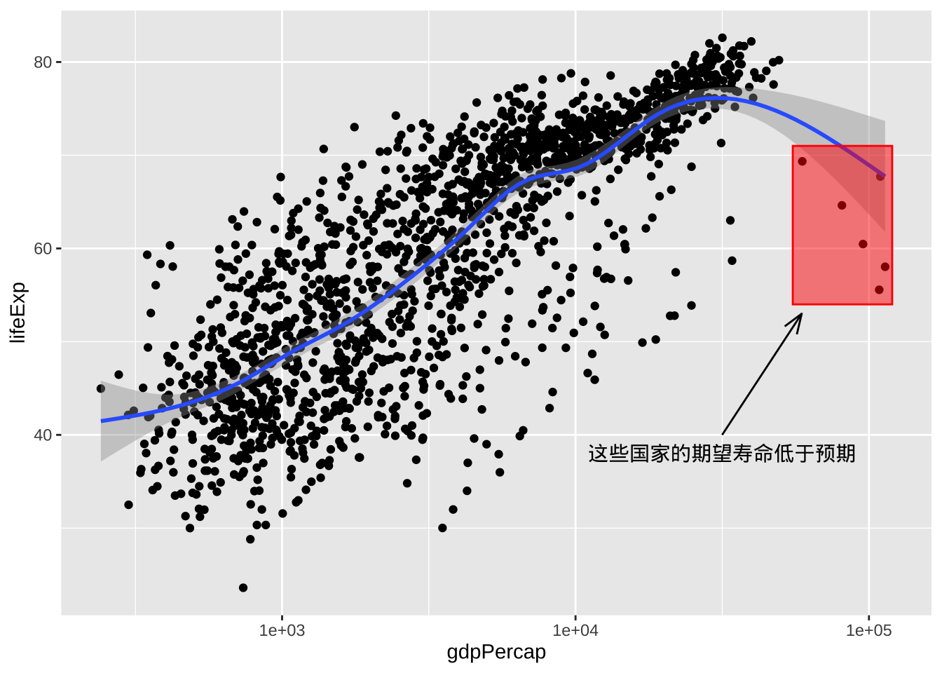
#iris例子 + annotate,hline,abline
ggplot(data = iris, mapping = aes(x = Sepal.Length, y = Sepal.Width)) +  # 底层画布
  geom_point() +
geom_smooth() 
可以用geom_hline()、geom_vline()和geom_abline()画横线、竖线、斜线。
ggplot2的默认主题会自动画参考线,可以用theme()函数指定参考线画法。
4.9.3 指南
对于颜色、填充色等维度,
会自动生成图例。用guides(color = FALSE)这样的方法可以取消指定维度的图例。
theme()可以调整一些整体的设置,如背景色、字体、图例的摆放位置。
例如:用theme()的legend.position改变图例的位置,
如theme(legend.position = "top")可以将图例放置在上方,
默认是放置在右侧的。可取值有"none"、"left"、"right"、"bottom"、"top",如:
#iris 例子
ggplot(data = iris, mapping = aes(x = Sepal.Length, y = Sepal.Width,col = Species)) +  # 底层画布
  geom_point() +
  geom_smooth() +
  theme(legend.position = 'left',panel.background = element_blank()) +theme_bw()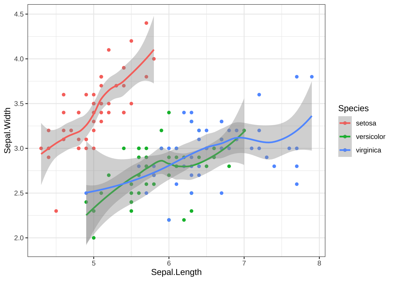
4.9.4 主题
ggplot2包作图可以实现内容与设计的分离,这里内容就是指数据、映射、统计、图形类型等方面,而设计就是指背景色、颜色表、字体、坐标轴做法、图例位置等的安排。将作图任务分解为内容与设计两个方面,可以让数据科学家不必关心设计有关的元素,而设计可以让专门的艺术设计人才来处理。这种工作分配已经在图书出版、网站、游戏开发等行业发挥了重要作用。
theme()函数用来指定设计元素,称为主题(theme),而且可以单独开发R扩展包来提供适当的主题。ggthemes扩展包是一个这样的包。
theme_set()可以改变后续ggplot2作图的主题(配色、字体等)。如theme_set(theme_bw()),theme_set(theme_dark())等。
对单次绘图,可以直接用加号连接theme_gray()等这些主题函数。
主题包括theme_gray()(默认主题)、theme_minimal()、theme_classic()等。
theme()函数还可以直接指定颜色、字体、大小等设置。
#iris 例子4.10 保存图片
ggplot2包中提供ggsave函数进行图形保存。ggsave函数的使用格式如下所示。
ggsave(filename,width,height,...)
其中,filename为保存的文件名与路径,width指图像宽度,height指图像高度。
示例:运行下列代码将会在当前工作目录下生成一个名为mygraph的pdf图形。
ggplot(iris, aes(x = Sepal.Length, y = Sepal.Width, colour = Species))+
  geom_point(size = 2)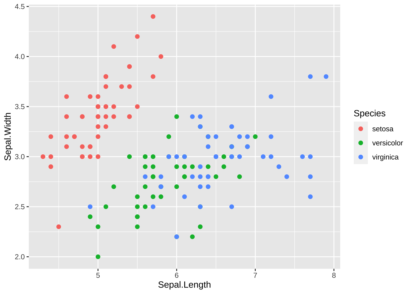
ggsave(file = "mygraph1.png", width = 6, height = 8)或者可以使用Rstudio界面进行保存图片,具体教程课件(R语言可视化基础教程)
4.11 例子
该部分来源于:公众号[小明的数据分析笔记本]。大家可以通过以下例子对今天所学的知识进行回顾。其他例子可以在第 \(\ref{#some-tips-alls}\) 找到。
4.11.1 柱状图+误差项
## 小明推送笔记《小明的数据分析笔记本》
# 跟着Nature microbiology学画图~R语言ggplot2画柱形图
# https://mp.weixin.qq.com/s/E-1X_VSq03AhvC_0cNEgyQ

library(ggplot2)

### 柱状图+误差项
data = data.frame("group" = c("A","B"),"value"=c(0.8,0.4),"errorbar"=c(.2,.1))
data
## group value errorbar
## 1 A 0.8 0.2
## 2 B 0.4 0.1p1 = ggplot(data,aes(x = group, y = value)) +
geom_col(aes(fill=group),color="black") + #柱状图
geom_hline(yintercept = 1,lty = 2) + #加横线
geom_hline(yintercept = 0.5,lty = "dashed") +
theme_bw() + #主题设置
theme(panel.grid = element_blank(), #网格为空
legend.position = "none") + #legend位置为无,就是不加
scale_y_continuous(expand = c(0,0),limits = c(0,1.5)) + #y为连续,设置ylim
scale_x_discrete(label = c("Ositive \n interactions","Negative\ninteractions")) + #x为离散
annotate("segment",x=1,y=0.8,xend=1,yend=1) + #加线段segment,当然这个函数可以加很多其他的包括字
annotate("segment",x=2,y=0.4,xend=2,yend=0.5) +
labs(x = NULL, #标签,注意\n可以空行
y = 'Absolute fold change\nin growth from co-cultures\ncompared to monocultures',
title = "Average growth fold change in\nco-cultures") +
annotate("segment",x=1,y=1,xend=1.2,yend=1.05) +
annotate("segment",x=2,y=1,xend=1.8,yend=1.05) +
annotate("segment",x=1.2,y=1.05,xend=1.8,yend=1.05) +
annotate("text", x = 1.5, y = 1.1, label = "p=0.005" ) +
scale_fill_manual(values = c("#ff8080","#90bff9")) #填充色使用离散颜色manual,两种颜色这里。
p1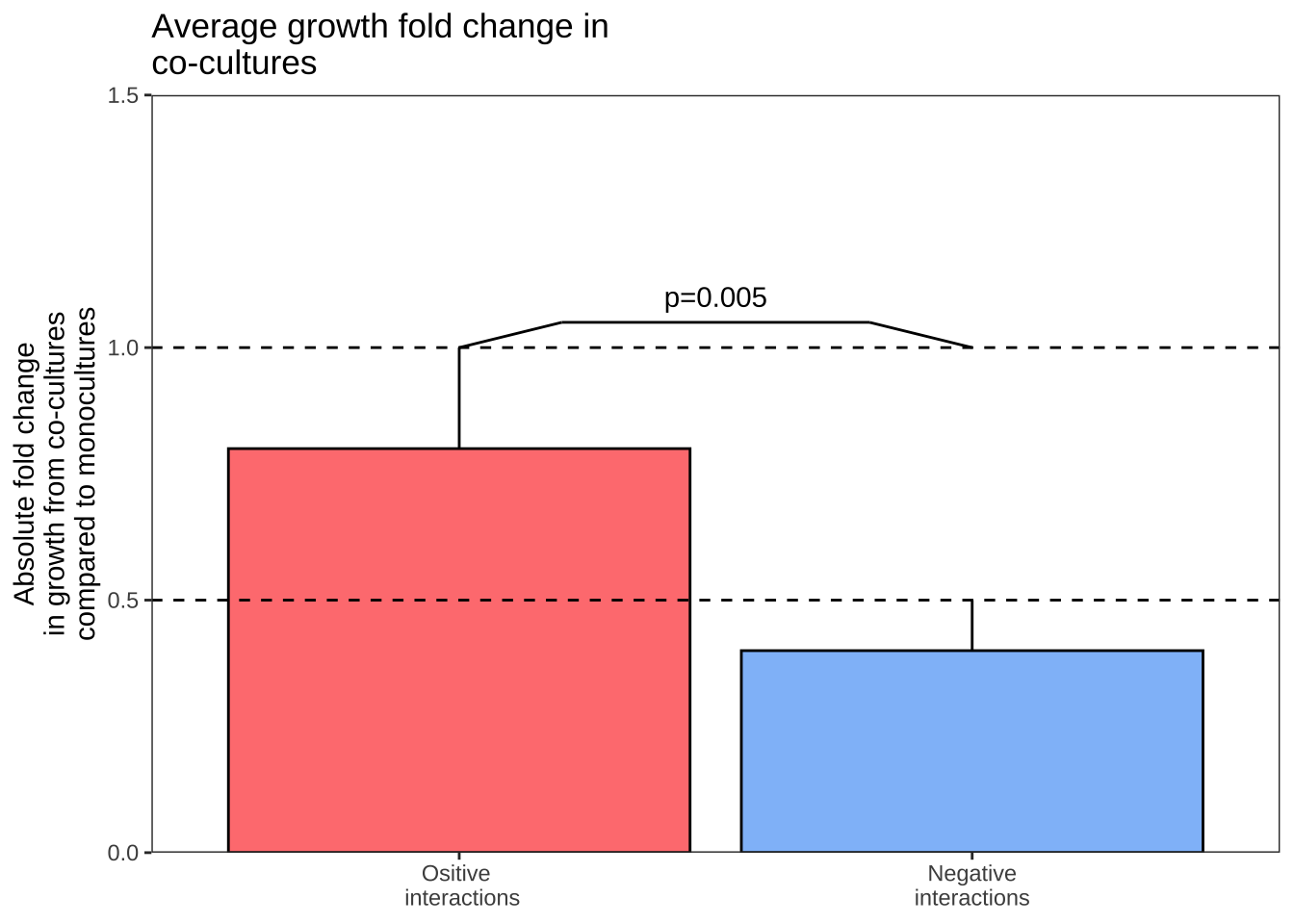
4.11.2 有正值和负值的柱形图
## 有正值和负值的柱形图

x <- 1:28
y <- sample(-100:150,28,replace = F)
df2 <- data.frame(x,y)
df2$x = as.factor(df2$x)
df2$group <- ifelse(df2$y>0,"A","B")
df2$group<-factor(df2$group,
                  labels = c("Synergistic interactions",
                             "Non-synergistic interactions"))
head(df2)
## x y group
## 1 1 62 Synergistic interactions
## 2 2 -58 Non-synergistic interactions
## 3 3 -100 Non-synergistic interactions
## 4 4 -72 Non-synergistic interactions
## 5 5 -23 Non-synergistic interactions
## 6 6 49 Synergistic interactionsp2 = ggplot(df2,aes(x,y)) +
geom_col(aes(fill = group),col = "black") +
geom_hline(yintercept = 100,lty = "dashed") +
geom_hline(yintercept = 50,lty = "dashed") +
geom_hline(yintercept = -50,lty = "dashed") +
theme_bw() +
theme(panel.grid = element_blank(),
axis.text.x = element_text(angle = 90,hjust = 0.5,
vjust = 0.5),
plot.title = element_text(hjust = 0.5),
legend.position = "bottom",
legend.title = element_blank()) + #取消标签的名称
scale_y_continuous(expand = c(0,0),
limits = c(-100,150),
breaks = c(-100,-50,0,50,100,150)) +
labs(x="Pairwise interactions",
y="Percentage change from\nmonoculture",
title = "Synergistic versus non-synergistic\ninteractions") + #标签说明
scale_fill_manual(values = c("#ff8080","#90bff9"))
p2 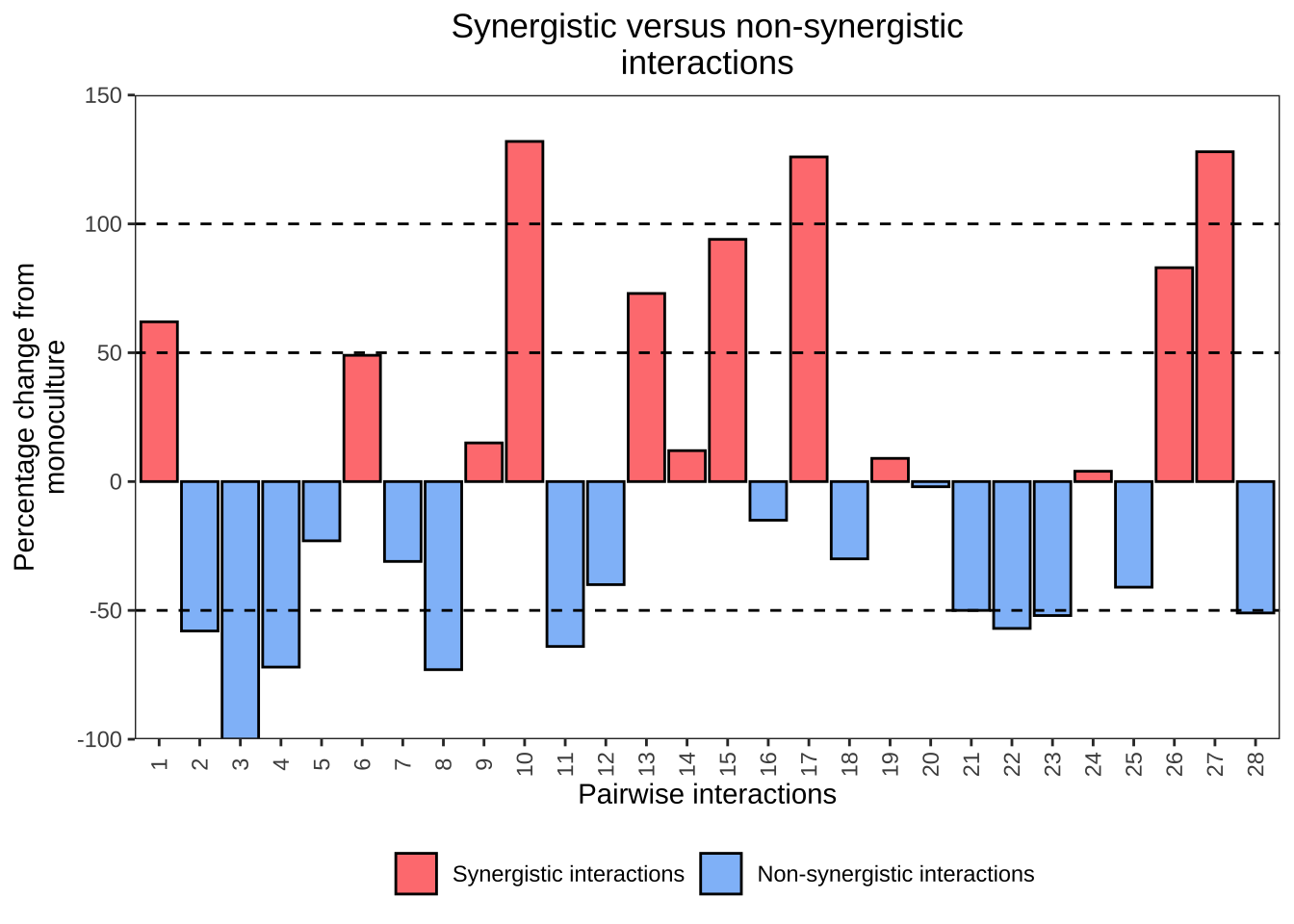
4.11.3 合并两图
合并两图或者多图可以使用以下包:
cowplot包的plot_grid()pathwork包gridEctra包的grid.arrange()
具体可以参考我公众号的这篇推文R可视乎|合并多幅图形
这里使用了cowplot包
## 合并两图(使用cowplot包)
library(cowplot)
pdf("test/plot_cow.pdf",width = 8,height = 4)
plot_grid(p1,p2,ncol = 2,nrow = 1,labels = c("d","e"))
dev.off()
## quartz_off_screen
## 2